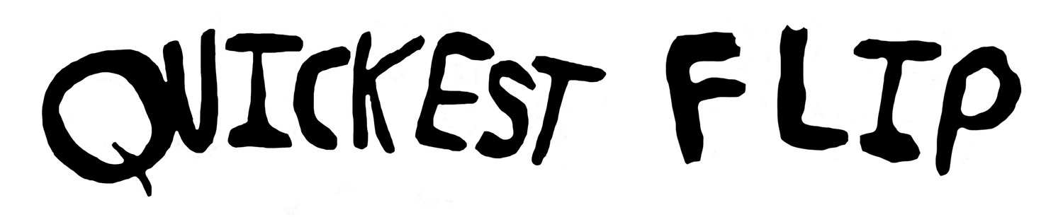
Landland
Looking for a “weirdo dancing woman scene?” Or something squalid and desolate? Either way, Landland is your source.
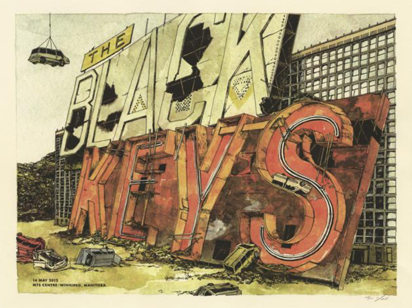
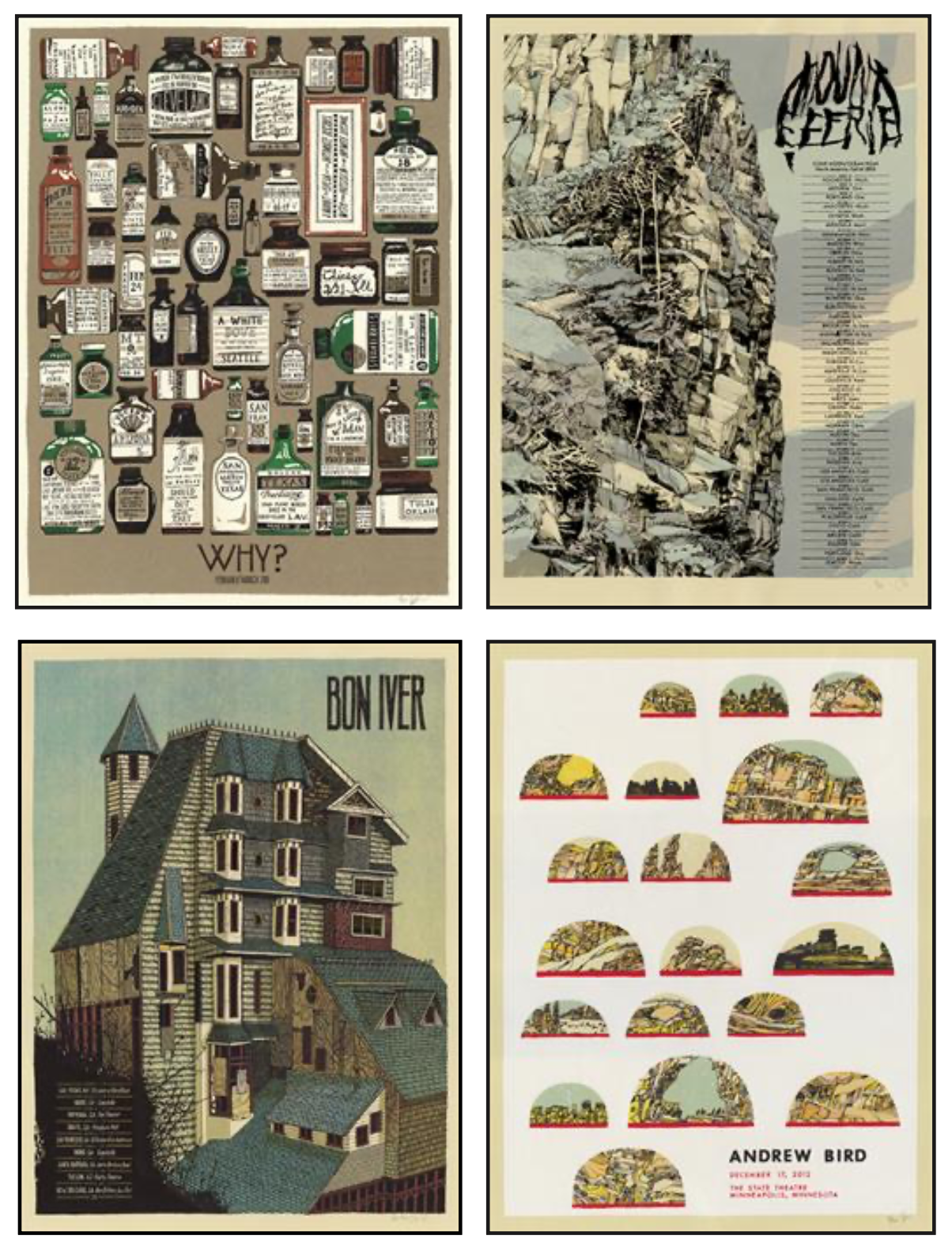
The small Midwestern studio formed by Jes Seamans, Dan Black and Matt Zaun 10 years ago crafts finely detailed illustrations, posters and record covers for the likes of the Black Keys, Andrew Bird, Bon Iver and Das Racist.
Quickest Flip was able to extract some words from co-founder Jes despite her busy, busy schedule and an upcoming move to Chicago.
How did you, Dan and Matt conspire to open a studio?
Landland is the official version of a thing that Dan and I have been doing together, on and off, since about 2002. We both had bands and liked drawing and had some screenprinting experience and wanted nice looking merchandise for our bands. For the next several years, Dan, his best bud Matt Zaun and I worked out of our various living rooms, basements, sheds, other peoples’ basements and sheds, and finally in 2007, Dan and Matt secured an actual dedicated studio and a name and decided to make a real, full-time go of it.
Matt died suddenly and unexpectedly shortly after things were up and running. He played an enormous role in the formation of Landland; he was one of the few people I’ve met who could match Dan’s energy, enthusiasm, will, and drive. He was also an extremely talented and self-taught designer with a really distinct typographic vision and we wonder all the time what Landland would look like were he still around.
The bulk of our work is the illustration, design and printing of tour and show posters for touring bands. We also make art prints, release records (the sleeves of which we design and also often print), and illustrate-for-hire. We plan to start publishing small-run art books sometime in the near future.
What inspires you?
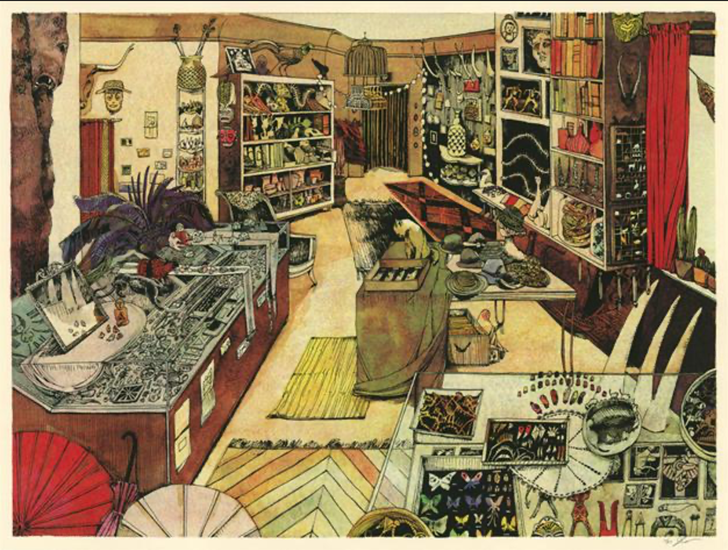
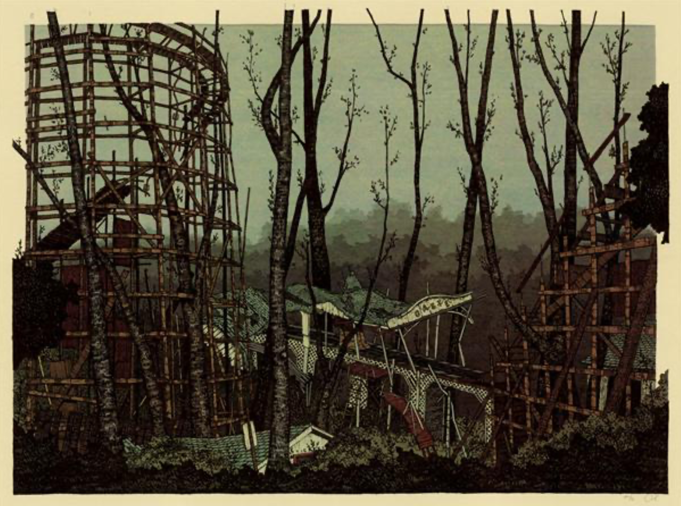
We’re both inspired by different stuff all the time. Because a lot of what we do is going to be attached to a band’s name, we always need to be taking into consideration the music, although we try to stay away from making posters that have any kind of literal interpretation or direct correlation to the band’s lyrics or name or immediate distinguishing characteristics. So that’s always a good starting point for a poster. And then, from there, I guess we both have our themes. Dan compulsively hunts down decrepit, falling-down structures on his trips across the country. He’s originally from rural Utah and still travels there frequently, which provides him with lots of fodder for his drawings. He grew up in a kind of squalid and desolate landscape, entertaining himself by playing in landfills and obsessively drawing road signs. I feel like the attraction to that kind of imagery persists, and he’s got a real talent for finding beauty in the dead and decayed.
My interest lands more with the living and moving. I draw a lot of figures and am often trying to convey movement and whatever you see on the page is usually part of some larger narrative I have in my head.
I’m lucky to live in Milwaukee which has a pretty strong film community and tradition, and there are always good film screenings and series, stuff I would never normally know how to seek out. Art films with reallllly, almost painfully, long shots; each frame perfectly composed. It gives me lots of time to think about color and composition and space and I know I’m drawing lots of inspiration from these. Kidlat Tahimik’s Perfumed Nightmare is a really incredible movie I recently watched. Also, Ben Rivers’ Two Years at Sea, the 1955 version of Night of the Hunter, Dario Argento’s Suspiria and several short works by a Chicago-based filmmaker named Jennifer Reeder are all things that I’ve seen in the past year that have really stuck with me and I’m sure are showing up somehow in various drawings of mine.
Do you have a favorite medium to work in? What’s your favorite part of what you do?
Well, the final medium is always silkscreen, and we kind of use whatever we need to on the front end to achieve the desired screenprinted result, so I guess a lot of the posters wind up involving a kind of mixed-medium approach. Nobody would ever want to buy one of my original drawings because I usually wind up drawing the thing on many separate sheets of paper, sometimes a stack. Often times my drawings look like nothing before I assemble them in the computer. Even with a lot of the watercolor stuff that I do, I’ll draw the keyline separately and then make the watercolor separately, using a light table. I’m always working with the final print in mind and not the actual drawing. Really, we both just love silkscreen. We’ve both been doing it for 10+ years (Dan is probably more like 15) and there seem to always be new things to learn and try.
It appears that music is correlated with a lot of the pieces that you produce. over, and we’ll get a long list of things they DON’T want to see show up in the art more often then they tell us what they do want. Every once in a while we get some pretty specific art direction from a band, but usually we’re left to do whatever we like.
I feel like we do have a little bit of a range of what our posters can wind up looking like; we’re learning that it’s important to have a band tell us which posters of ours they like specifically, because we’ve had a couple bad situations where someone totally thought they were getting a Dan Black Decrepit Building and instead they got a Jes Seamans Weirdo Dancing Woman Scene and were BUMMED OUT.
We’re lucky that we both started by making posters for our own bands and then for friends bands, where we could do whatever we wanted, and we could experiment like crazy. Years and years of that gave us enough of a portfolio that when we started getting commissions for these higher-profile acts, when we started doing it full-time, they were coming to us asking for work based on these with which we had complete freedom, and so we were kind of grandfathered in to doing whatever the fuck we wanted, which was awesome.
Is the relationship between music and art changing with people promot ing shows on facebook instead of walls and downloading mp3s instead of buying records? Is that making what you do more difficult - financially or otherwise?
Actually, I think it’s making what we do more in demand. The heyday of the strictly promotional show poster is definitely over, which really does make me sad and nostalgic; I definitely miss running around town flyer-ing, and I really miss seeing all these great handprinted-on-whatever-crappy-paper-is-lying around posters up all over town, and being part of that.
However, from the perspective of making an actual career of it, the new situation is way better for us. When posters were being used for promotion it was actually often the venues we were working with, and there are a lot of downsides to that. Now we usually get commissioned directly by the bands and because they’re using them exclusively as souvenirs for their shows, they can pay more and they care more which means that we are being compensated for spending the kind of time on it that we want.
I think part of the reason people are becoming more interested in buying a 20 dollar 18x24 handprinted poster at a show for a band they love is in part due to the fact that there are fewer tangible ways for them to experience that band now that so much music is collected and listened to digitally.
With a screenprinted poster, it’s something touched by a human hand; you can feel the texture of the ink; it’s tactile and kind of special.
What’s the next big project for Landland?
I was just commissioned by this guy to do a painting of him and his wife surrounded by their massive collection of cats, goat heads and taxidermied sheep. He specifically requested that I make sure the thing has “bad vibes.” So that should be pretty fun!
Dan’s got some records he’s excited to release, a couple big projects for bands that I don’t think I’m allowed to talk about yet, and we’ve got a lot of art prints waiting in the wings. The biggest thing ahead of us right now is moving Dan and our entire studio to Chicago, so he and I can be closer together.